Psychological Effects of Colors
Colors play a crucial role in our daily lives, influencing our emotions and behavior. Studies across various fields, such as design, marketing, psychology, and architecture, have shown that each color has a distinct effect on our mood and actions.
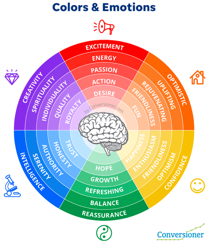
Warm colors like red, orange, and yellow can boost productivity and speed, making us feel more energetic and alert. On the other hand, cool colors like blue and green promote relaxation and focus, helping us stay calm and composed.
The intensity and saturation of a color also matter. Bright and bold colors tend to be more energetic and playful, while muted or pastel colors are soothing and understated.
Colors in Different Settings
Colors can be used strategically in various situations. For instance, wearing neutral colors in job interviews can make you appear trustworthy and organized. In branding, specific colors can elicit desired emotional responses from consumers. For example, Apple uses a minimalist white to communicate simplicity and elegance.
Color trends often reflect the state of the world. Neutrals have gained popularity for their commercial appeal, and Coloro’s 2023 color of the year symbolizes a growing need for escapism and inclusivity.
Color Therapy and Healing
Color therapy is a holistic practice that uses specific colors to promote physical, emotional, and spiritual healing. It is a part of various alternative and complementary practices, offering a unique approach to wellness.
In conclusion, the psychological effects of colors are powerful and multifaceted. Ongoing research continues to uncover new insights and applications for the impact of color on human behavior and emotions. By understanding the influence of colors, we can harness their power to enhance our lives and surroundings.
Colors in Marketing and Branding
Colors play a crucial role in marketing and branding, as they help create a brand’s identity and can influence consumer decisions. For instance, NYU Langone Hospital is suing Northwell Health for allegedly copying its signature purple color in ads and even painting one of its buildings in that color. This demonstrates the importance of color in establishing a unique brand image.
Color Psychology in Branding
Companies often use color psychology to evoke specific emotions and associations. For example, red is associated with energy, excitement, and passion, while green is linked to health, growth, and harmony. Peloton, a popular fitness company, uses red and green in its marketing campaigns, including TV ads, social media posts, and email promotions. These colors align with Peloton’s brand identity, which is built on the idea of a community of people working together towards fitness goals.
Color Impact on Consumer Decisions
Color can increase brand recognition by up to 80% and influence consumer purchasing behavior. For instance, researchers at the University of Genoa have developed a smart packaging technology that changes color depending on the quality of the product in the package, potentially detecting premature spoilage in food products. This use of color in packaging can impact consumer perception of product quality and freshness.
Color Trends and Brand Differentiation
Companies can use color to differentiate themselves in crowded markets. WGSN, a global trend forecasting agency, has selected Digital Lavender and Luscious Red as their Color of the Year for 2023, based on consumer trends and catering to a renewed sense of optimism, hope, balance, and powerful, emotionally-engaging brights. Timeless and investment shades like Oat Milk and Parchment also appeal to conscious consumers, drawing on elegant comfort and low-key luxury trends.
In conclusion, the strategic use of color in marketing and branding can significantly impact consumer decisions and brand recognition. Companies must carefully select their brand colors to evoke the desired emotions and associations, while also considering cultural interpretations and staying up-to-date with color trends.
Color Theory and Color Harmony
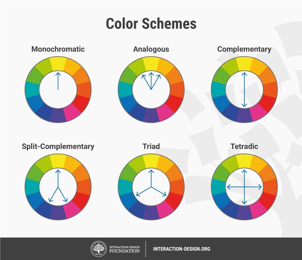
Color theory is a fascinating domain that deals with the principles of color and how they interact with each other. It provides a framework for designers, architects, and artists to create aesthetically pleasing color schemes that evoke desired emotions and responses. The color wheel, created by Isaac Newton during the 17th century, is a fundamental tool for understanding color relationships. Canva’s Color Wheel is an excellent online resource for exploring these relationships.
Understanding Hue, Saturation, and Value
Hue, saturation, and value are the three main principles of color theory. Hue refers to which color is in use, saturation refers to the intensity of the color, and value refers to the lightness or darkness of a color. These principles help designers create harmonious color schemes.
Monochromatic, Analogous, and Complementary Schemes
Color schemes, such as monochromatic, analogous, and complementary, are used to create harmonious combinations of colors. Monochromatic palettes create a unified aesthetic by using varying shades, tints, and tones of a single color. Analogous color schemes create dynamic designs by combining colors next to each other on the color wheel. Complementary color schemes create high-contrast effects by choosing opposite locations on the color wheel.
Color Psychology and Emotional Impact
Colors can evoke different emotions and feelings in people, making color psychology a crucial aspect of color theory. Warm colors like red, yellow, and orange are stimulating, while cool colors like green and blue are relaxing. Different combinations of warm and cool colors can create an atmosphere of excitement or relaxation in a given space.
Practical Applications of Color Theory
Color theory has practical applications in various fields, such as fashion, cosmetics, and medicine. In branding and marketing, complementary colors can create a strong visual identity for a company or product. For example, Coca-Cola uses red and white, while Pepsi uses blue and red, creating memorable and eye-catching logos.
Overall, color theory is a fascinating and essential field of study to enhance the aesthetics of design, architecture, and art. It provides designers with a framework to create harmonious color schemes that evoke desired emotions and responses, making it crucial for design on all scales.
Cultural Significance of Colors
Colors play a significant role in our lives, shaping our emotions, behavior, and even our decision-making processes. In the realm of cultural significance, colors hold unique meanings and interpretations across various societies and traditions.
Color Meanings Around the World
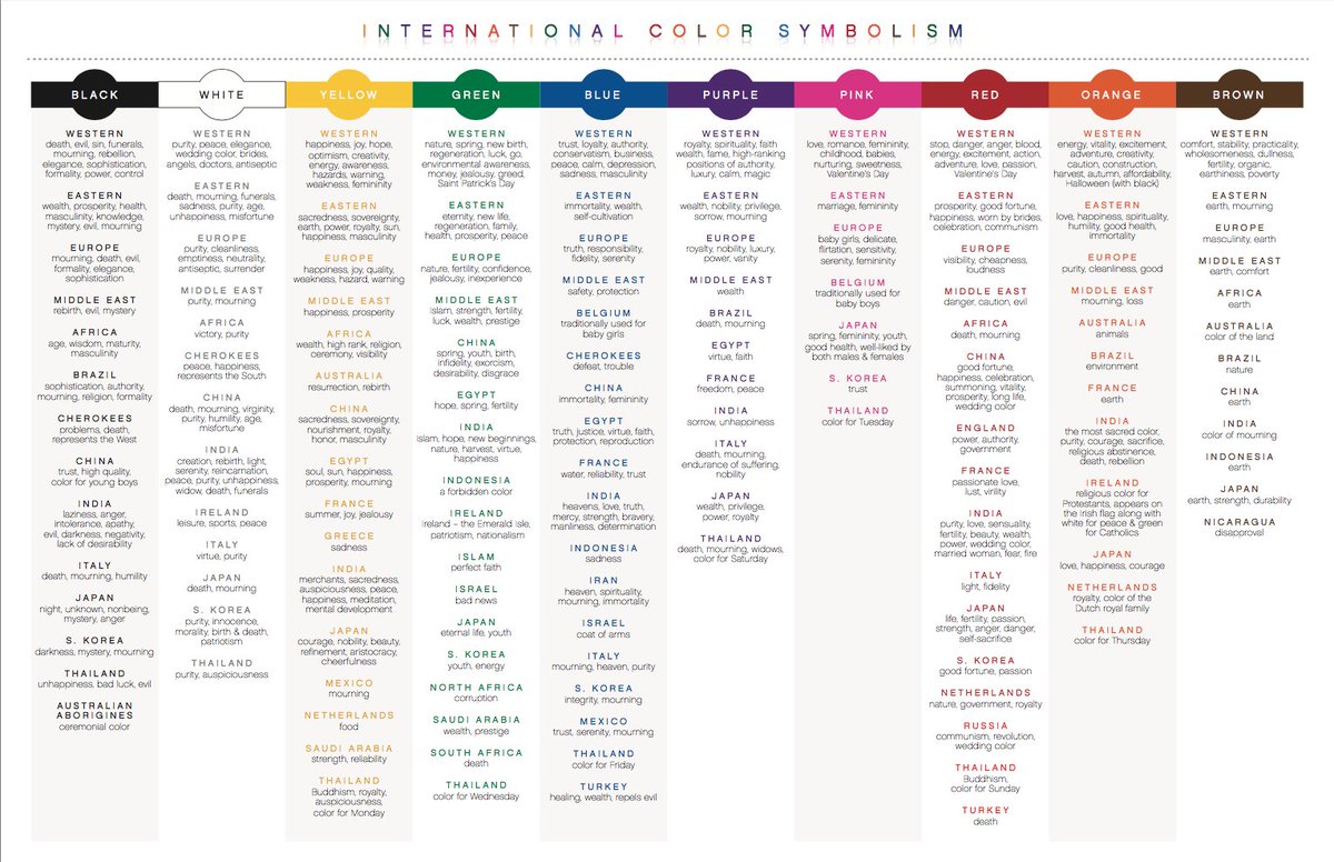
One fascinating aspect of colors is their varying symbolism in different cultures. For instance, black is often linked to mourning or darkness in Western cultures, while it can signify power and wealth in some Asian societies. Similarly, red is associated with good luck and prosperity in China, but it represents mourning in South Africa.
In India, white symbolizes purity and is commonly worn at weddings, while in some African cultures, it denotes death. Thailand regards purple as a royal color reserved for royalty, whereas Brazil associates it with mourning. These diverse cultural interpretations of colors highlight the importance of understanding and respecting the unique perspectives of people from various backgrounds.
Colors in Global Marketing
In the world of marketing and branding, colors play a crucial role in resonating with target audiences.
To create a successful international marketing strategy, it is essential to consider the cultural significance of colors and adapt accordingly. Localization is vital for connecting with consumers, and continual monitoring and optimization of marketing strategies are necessary to ensure success.
One useful tool for enhancing cultural competence is Hofstede’s Cultural Dimensions, which can provide valuable insights into the preferences and values of different societies. Additionally, regularly reviewing analytics can help marketers gauge the performance of their international marketing efforts and make data-driven decisions.
Awareness Ribbons and Cultural Significance
Colors also serve as powerful symbols for raising awareness about various issues and causes. Awareness ribbons, for example, come in different colors, each representing a specific cause or issue. The meanings behind these ribbons can evolve over time and vary between cultures, making it essential to understand their significance to bridge cultural and societal gaps.
In conclusion, colors hold immense power in shaping our emotions, behavior, and cultural perceptions. By understanding the cultural significance of colors, we can foster greater empathy and connection with people from diverse backgrounds, ultimately creating a more inclusive and harmonious world.
Colors in Interior Design
Colors play a crucial role in interior design, influencing the mood and atmosphere of a space. By understanding the psychological effects of colors, designers can create inviting, cozy, and luxurious spaces that appeal to homeowners and potential buyers alike.
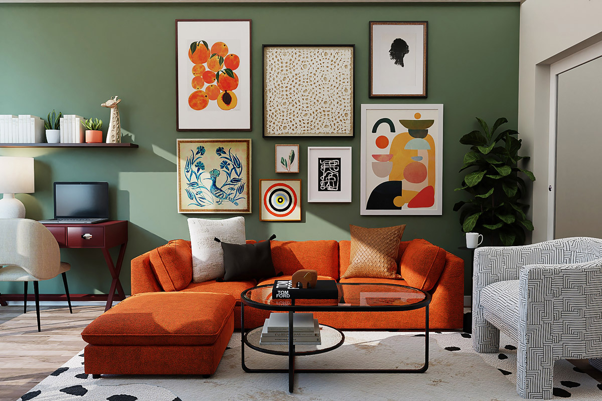
One recent trend in interior design is the preference for darker, more dramatic colors over bland and neutral shades. For instance, charcoal gray has been associated with higher offer prices in various rooms, including kitchens and living rooms. Homes featuring these colors can sell for an estimated $2,512 more than similar properties. Earth tones, such as terracotta brown, also fetch higher offer prices, particularly in bathrooms. (source)
According to color psychology specialists, gray creates a feeling of security and retreat, making it a popular choice for interior spaces. Buyers are drawn to dark gray on a psychological level, seeking a refuge in their homes. The right paint colors can appeal to more buyers and potentially boost a home’s resale value.
However, not all shades of gray are equal. Mid-tone gray can hurt a home’s sale price when used on the front door, while buyers prefer black or mid-tone rosy brown doors. A home’s ultimate sale price depends on several factors, but paint colors can have an outsized impact on a buyer’s perception.
Designers often use color palettes and combinations to create specific themes and styles. For example, kitchen cabinet color trends for 2023 include a variety of shades, from pale sage green to inky black and blush pink. Black-painted cabinets, paired with dark wood and patterned marble, can create a sophisticated and theatrical mood.
To balance dramatic colors, designers should incorporate soft earthy tones and natural materials for a warmer, homely ambiance. Cashmere, a versatile color ranging from beige to gray, is a go-to choice for injecting warmth and simplicity into kitchens. However, lighting conditions can alter the appearance of each cashmere shade.
In summary, colors have a significant impact on the mood and atmosphere of interior spaces. By understanding the psychological effects and staying up-to-date with trends, designers can create beautiful, inviting, and valuable spaces for homeowners and potential buyers alike.